Free Usability Testing Survey
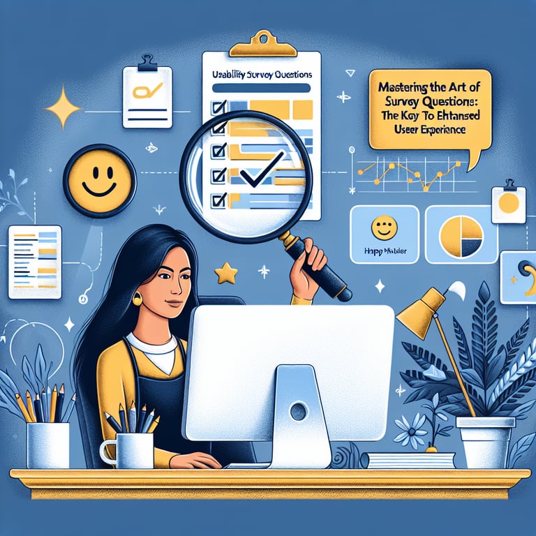
50+ Expert Crafted Usability Testing Survey Questions
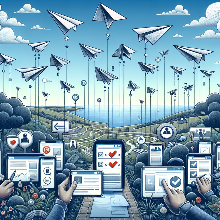
Measuring usability testing gives you the insights you need to streamline your interface, eliminate pain points, and boost user satisfaction. A usability testing survey gathers direct feedback on navigation, clarity, and overall experience - data that's essential for informed design decisions. Grab our free template, preloaded with example questions, or head over to our online form builder to customize your own survey in minutes.
Trusted by 5000+ Brands

Top Secrets Every Designer Must Know About a Usability Testing Survey
A Usability Testing survey can make or break your product launch. It reveals user frustrations and uncovers hidden opportunities before code hits production. When you start with clear objectives, you guide real users to perform tasks while you observe. This survey isn't guesswork; it's data-driven design that powers success.
Designers rely on Usability Testing to validate ideas before coding. The U.S. Department of Energy recommends recruiting representative participants and testing at multiple stages (Usability Testing Best Practices). You'll learn whether your navigation flows, calls to action, and labels work as intended. Early feedback saves time, budget, and user frustration.
Approach your survey like a detective unraveling mysteries. Define user personas, craft simple tasks, and set success metrics in advance. Ask open-ended and scaled questions to balance narrative depth with quantitative comparisons. For example, "What do you find most confusing about this layout?" and "How easy was it to complete your task?". Real responses guide iterative tweaks.
Imagine testing a shopping cart on mobile. You watch Sarah struggle to locate the checkout button. A quick poll in your broader research highlights this pain point across multiple sessions - crucial intel before redesign. This hands-on moment shows why testing early beats guessing later.
As you roll out your first survey, keep it concise and focused. Limit your questions to core functionalities to avoid fatigue. Review results weekly and iterate instantly to maintain momentum. With these top secrets, you'll boost conversion, cut support tickets, and delight your users.
Ready to get started? Explore our Usability Survey templates for proven question sets, expert tips, and a head start on success. Use built-in analytics and export features to share insights with your team. Let real user voices guide your next big decision.
5 Must-Know Tips to Dodge Noisy Feedback in Your Usability Testing Survey
Common mistakes can derail even the best laid survey. You might overload participants with too many tasks or use jargon-filled language. These issues confuse users and contaminate your data. Recognizing pitfalls early keeps your insights sharp and actionable.
Avoid vague or leading questions. Don't ask, "Did you like our homepage?" Instead, break it down: "What frustrates you about our navigation?" By sharpening wording you get honest, relevant feedback. Clear questions reduce guesswork for both participants and analysts.
Skipping dry runs wastes time. The University of Michigan toolkit (Usability Testing Best Practices for Academic Library Websites & DIY Usability Testing Toolkit) shows that rehearsing your script prevents glitches. A single dry run can reveal confusing prompts or broken links before participants show up. Test early to avoid client delays.
Steer clear of too many Likert scales in a row. Mix in open-ends like "What feature would improve your experience?" and task-based probes such as "Did you encounter any errors during checkout?". This balance uncovers trends and rich anecdotes you can act on immediately.
Relying only on expert reviews can skew your perspective. Pair heuristic checks from Heuristic Evaluation with live testing to spot blind spots. Diverse input catches both big and subtle issues, giving you a fuller picture.
Don't skip iterative rounds. After each test, tweak your survey and test again. Even minor adjustments reveal new insights in the next User Testing Survey round. Fast cycles keep projects on track and budgets in check.
Picture an academic library site redesign. The team refines their question set each week, based on student feedback. They catch navigation hiccups before launch, thanks to targeted tasks and clear questions. Use these tips to craft surveys that yield crystal-clear direction.
Task Completion Questions
This section focuses on users completing key tasks within the interface to gauge overall effectiveness and efficiency. By measuring success rates and identifying friction points, you can refine core workflows for a smoother experience. For more detailed methodology, see our User Testing Survey .
-
Were you able to complete the primary task you attempted without assistance?
This question directly measures task success, revealing whether users can achieve goals independently.
-
How long did it take you to finish the primary task?
Time-on-task highlights efficiency and helps identify steps that may slow users down.
-
Did you encounter any unexpected obstacles while completing the task?
Identifies specific pain points or confusing elements that hinder task flow.
-
Were the steps required to complete the task clear and logical?
Assesses whether the process aligns with user expectations and mental models.
-
Did you know exactly what to do at each step of the process?
Evaluates clarity of instructions and prompts throughout the workflow.
-
Did any element prevent you from completing the task?
Pinpoints critical blockers that demand immediate design or technical fixes.
-
How confident were you that you had completed the task successfully?
Measures user confidence, indicating whether outcomes feel reliable and understandable.
-
Did you need to use help features or documentation to finish the task?
Reveals reliance on support resources and potential gaps in the interface guidance.
-
Would you attempt this task again without hesitation?
Determines overall comfort level and willingness to repeat the process.
-
What improvements would make this task easier to complete?
Collects user-driven suggestions for optimizing the core workflow.
Navigation Ease Questions
This category evaluates how effortlessly users move through menus, links, and pages to find what they need. By understanding navigation patterns and pain points, you can streamline pathways for faster access. Explore best practices in our User Interface Survey .
-
How easily could you find the main menu or navigation bar?
Measures visibility and accessibility of primary navigation controls.
-
Were the menu labels descriptive and helpful?
Assesses clarity of link text in guiding users to correct sections.
-
Did you get lost or feel unsure about where you were in the site?
Checks orientation and effectiveness of visual cues like breadcrumbs.
-
How straightforward was it to move between pages?
Evaluates consistency of navigation elements across the interface.
-
Did you find a clear way to return to the homepage or dashboard?
Ensures users can quickly reset their navigation path when needed.
-
Were important pages prioritized in the navigation hierarchy?
Determines whether key content is surfaced effectively for users.
-
Did link placement and order match your expectations?
Assesses logical grouping and sequence of navigation items.
-
How clear was the path to complete secondary tasks (e.g., settings, help)?
Checks discoverability of less frequent but necessary functions.
-
Did you use the search feature, and was it helpful?
Measures usefulness of search as a complement to browsing navigation.
-
What changes would improve your ability to navigate the site?
Gathers user recommendations for enhancing overall navigation design.
Content Clarity Questions
This set examines whether labels, instructions, and feedback are understandable and actionable. Clear content reduces confusion and empowers users to proceed confidently. Learn about content best practices in our User Friendliness Survey .
-
Were the labels on buttons and links easy to understand?
Evaluates if calls to action clearly communicate their purpose.
-
Did the instructions guide you effectively through each step?
Assesses whether procedural text provides adequate support.
-
Was any terminology confusing or unfamiliar to you?
Identifies jargon or unclear words that may alienate users.
-
Did content hierarchy (headings, subheadings) help you scan the page?
Checks if structural cues facilitate quick comprehension.
-
How clear were the error messages you encountered?
Measures whether feedback explains issues and suggests fixes.
-
Was the tone and style of the text appropriate for your needs?
Determines if brand voice aligns with audience expectations.
-
Did you feel informed at each stage of your interaction?
Evaluates whether progress indicators and updates keep users engaged.
-
Were any important details missing or hard to find in the content?
Highlights gaps that could lead to user frustration or task failure.
-
Did you struggle to understand any terms or phrases?
Identifies specific wording that may require simplification.
-
What suggestions do you have to make content clearer?
Encourages user-driven improvements to enhance overall comprehension.
Visual Design Questions
This category assesses aesthetic appeal, readability, and visual hierarchy to ensure design supports usability. Strong visuals guide focus and improve user satisfaction. See our guidelines in the UX Survey .
-
How visually appealing did you find the overall design?
Measures first impressions and emotional response to aesthetics.
-
Was the text easy to read in terms of size, color, and contrast?
Checks accessibility and readability across devices and lighting.
-
Did the layout help you locate key elements quickly?
Assesses use of whitespace and grouping for clear visual hierarchy.
-
Were icons and graphics meaningful and supportive?
Ensures imagery reinforces content rather than confusing users.
-
Did color choices guide your attention effectively?
Evaluates use of color for call-outs, alerts, and primary actions.
-
Did the interface feel cluttered or overwhelming at any point?
Identifies areas where too much information may strain user focus.
-
How consistent were design elements across different pages?
Checks uniformity in style, spacing, and component behavior.
-
Were interactive elements (buttons, links) easy to identify?
Assesses visual affordances that signal clickability or touch-ability.
-
Did animations or transitions enhance or distract from tasks?
Measures whether motion supports clarity or causes unnecessary delay.
-
What visual improvements would make the interface more engaging?
Gathers user suggestions for elevating the overall design quality.
Error Handling Questions
This section examines how well the system detects, reports, and recovers from errors to maintain user trust and flow. Effective error handling reduces frustration and aids task recovery. For standardized metrics, refer to our System Usability Scale Survey .
-
Did you encounter any error messages during your session?
Identifies whether the system fails gracefully or not.
-
Were error messages clear and informative?
Checks if messages explain what went wrong in simple terms.
-
Did the error messages suggest steps to resolve the issue?
Assesses whether guidance is provided to recover from errors.
-
Were you able to correct your error and continue easily?
Measures the effectiveness of recovery mechanisms.
-
Was the system forgiving of minor mistakes (e.g., typos)?
Evaluates tolerance for user errors and input validation quality.
-
Did the interface prevent you from making critical errors?
Checks use of confirmations, warnings, and constraints for protection.
-
How did you feel about the support offered after an error?
Assesses user confidence in help features and documentation.
-
Did any error leave you stuck or unable to proceed?
Highlights blocking issues that require urgent attention.
-
Were automatic error corrections (if any) helpful?
Measures whether features like auto-complete or suggestions add value.
-
What improvements would make error handling more user-friendly?
Collects feedback for strengthening error detection and recovery.